Luis Barragan / Brand Identity / Instructor : Pedro Mendes
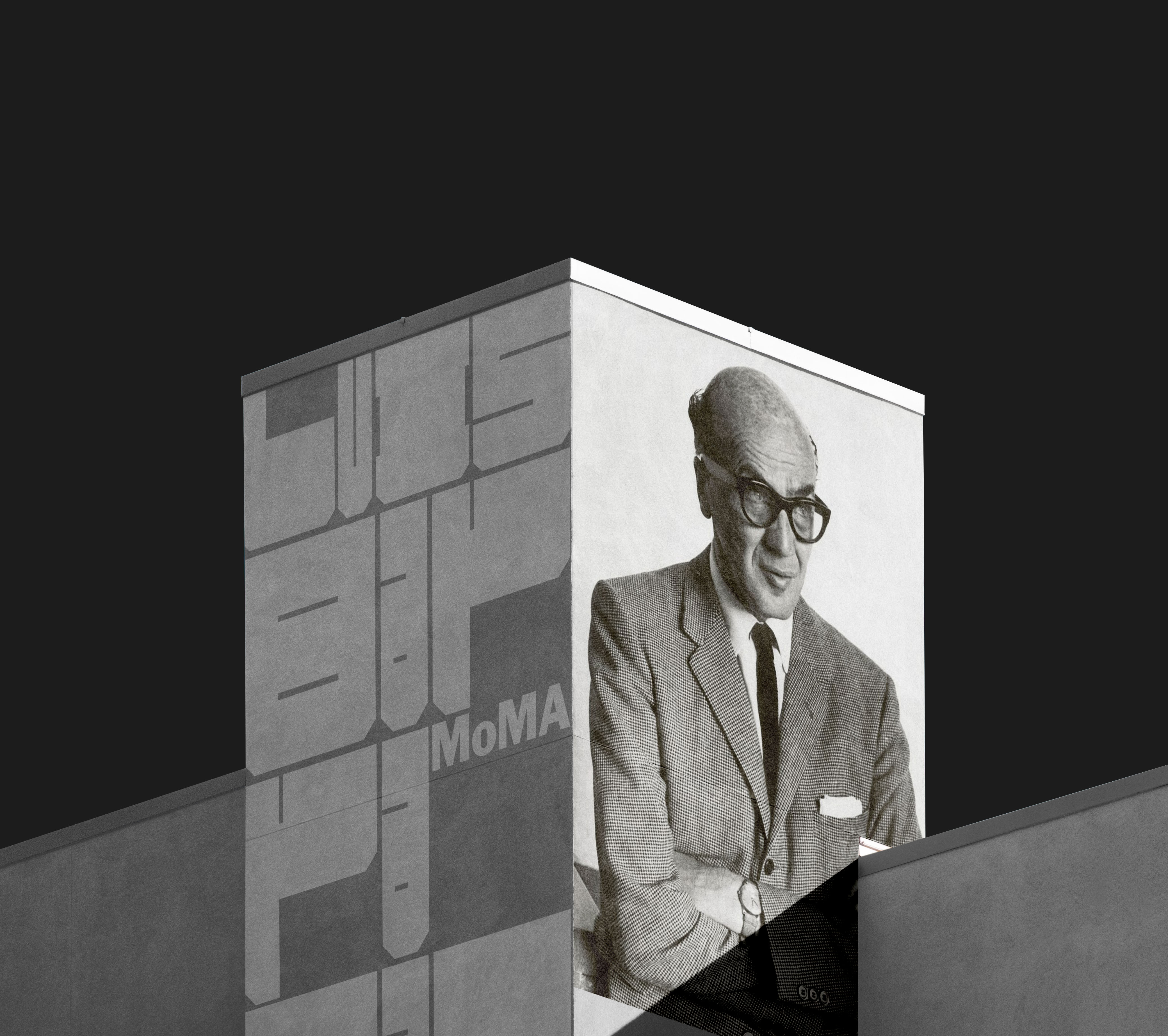
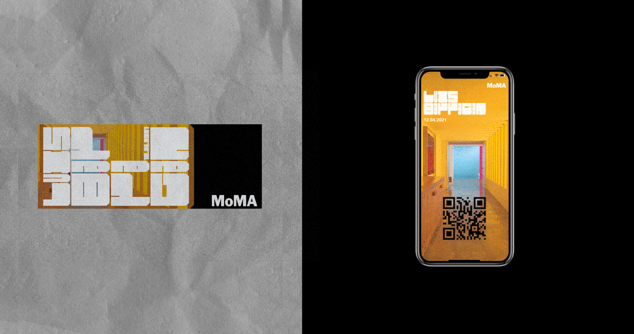
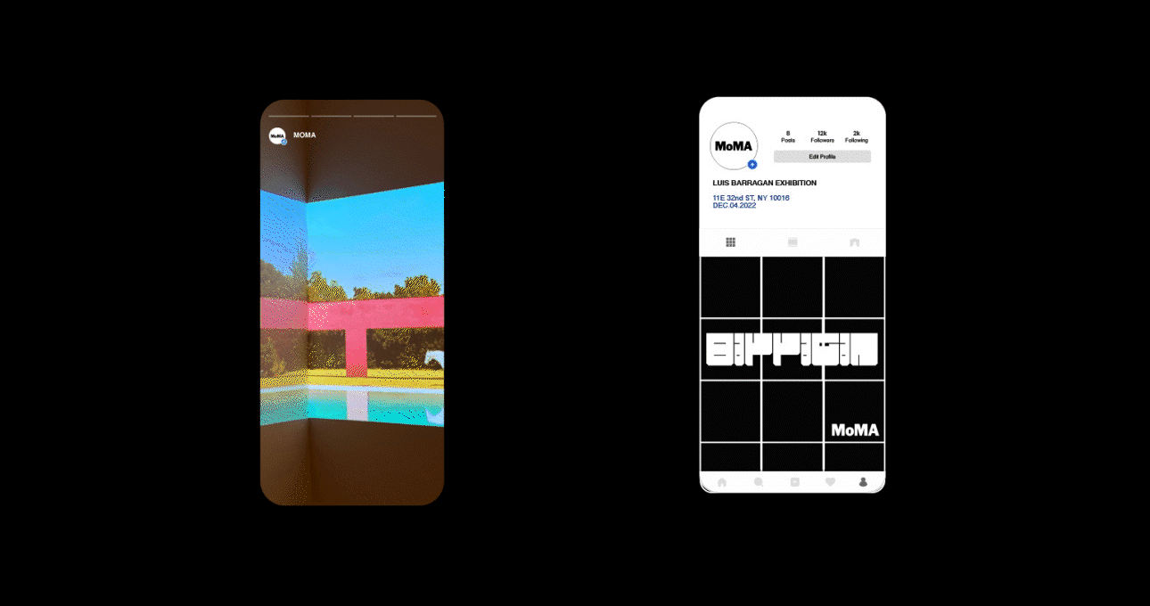
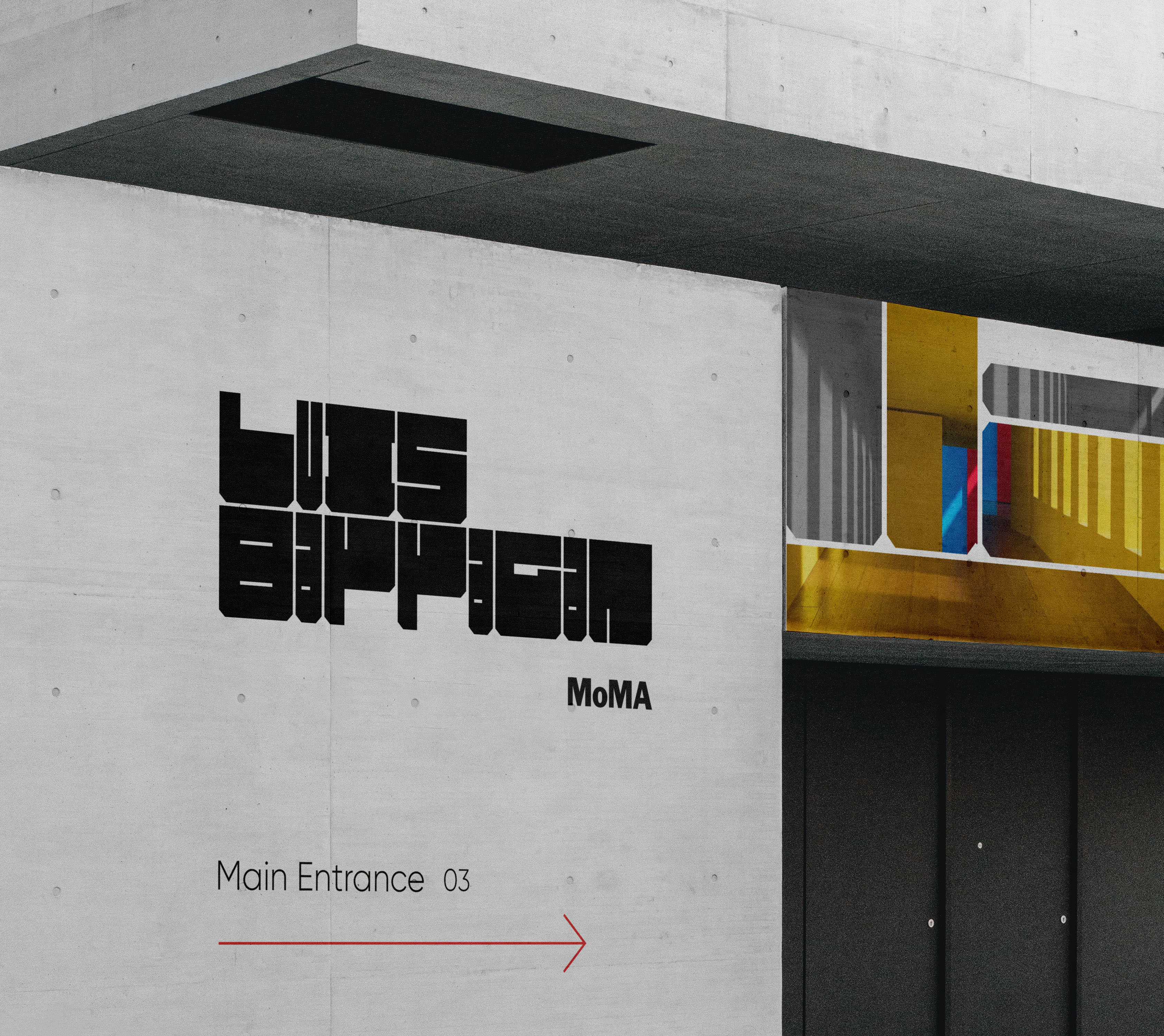
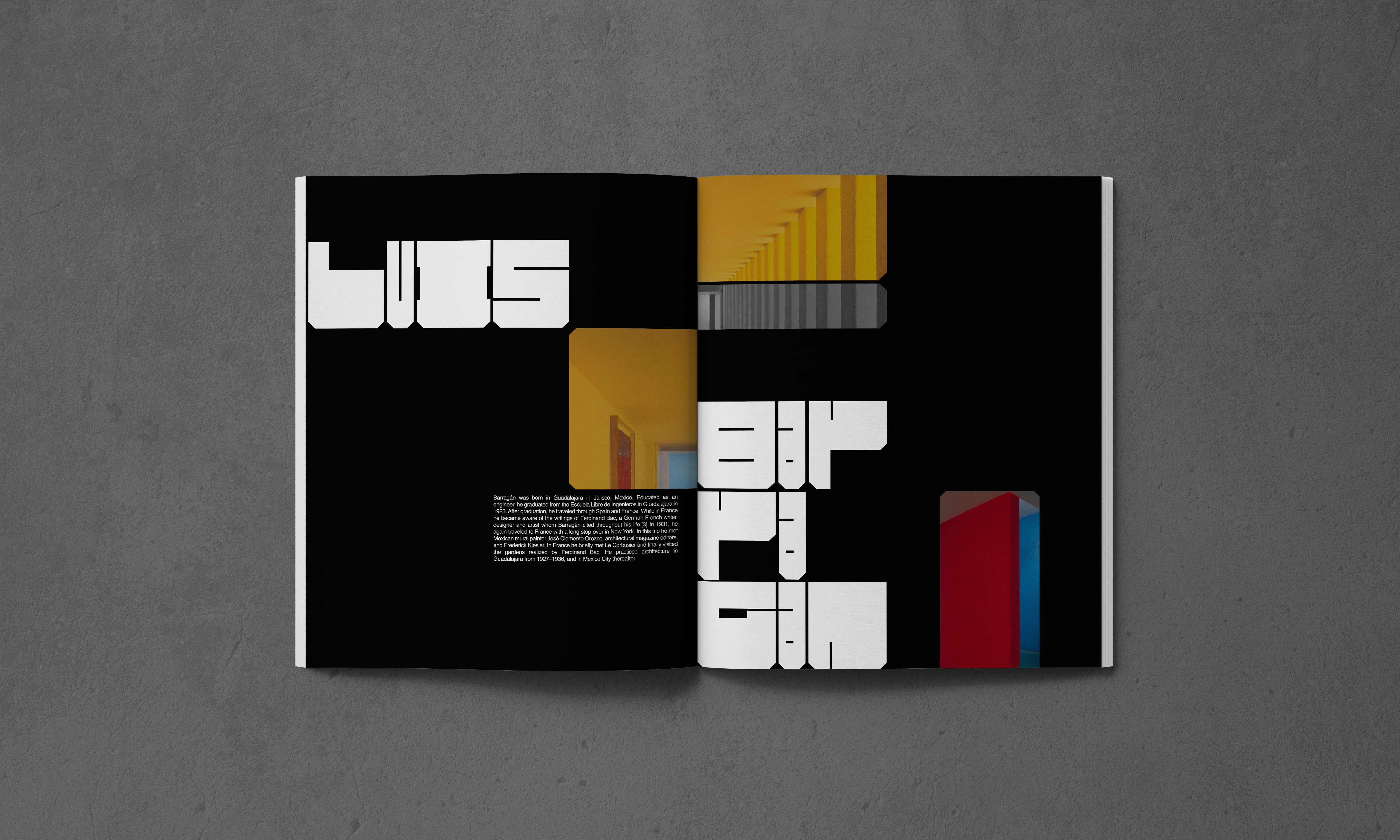
Luis Barragan is a Mexican architect who is well known for his emphasis on color and blocked structures.
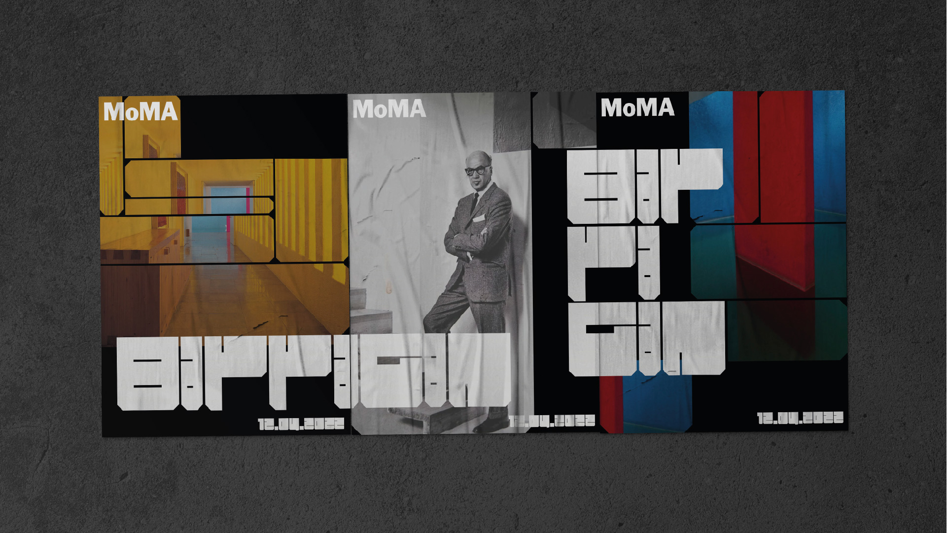
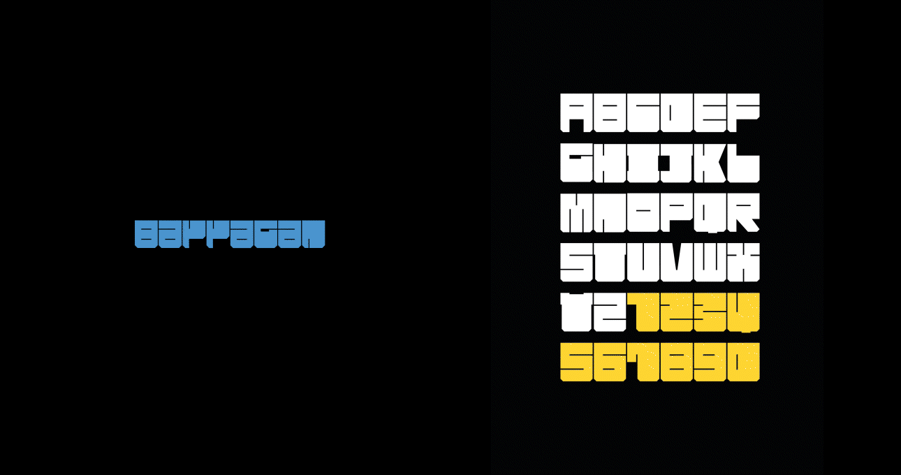
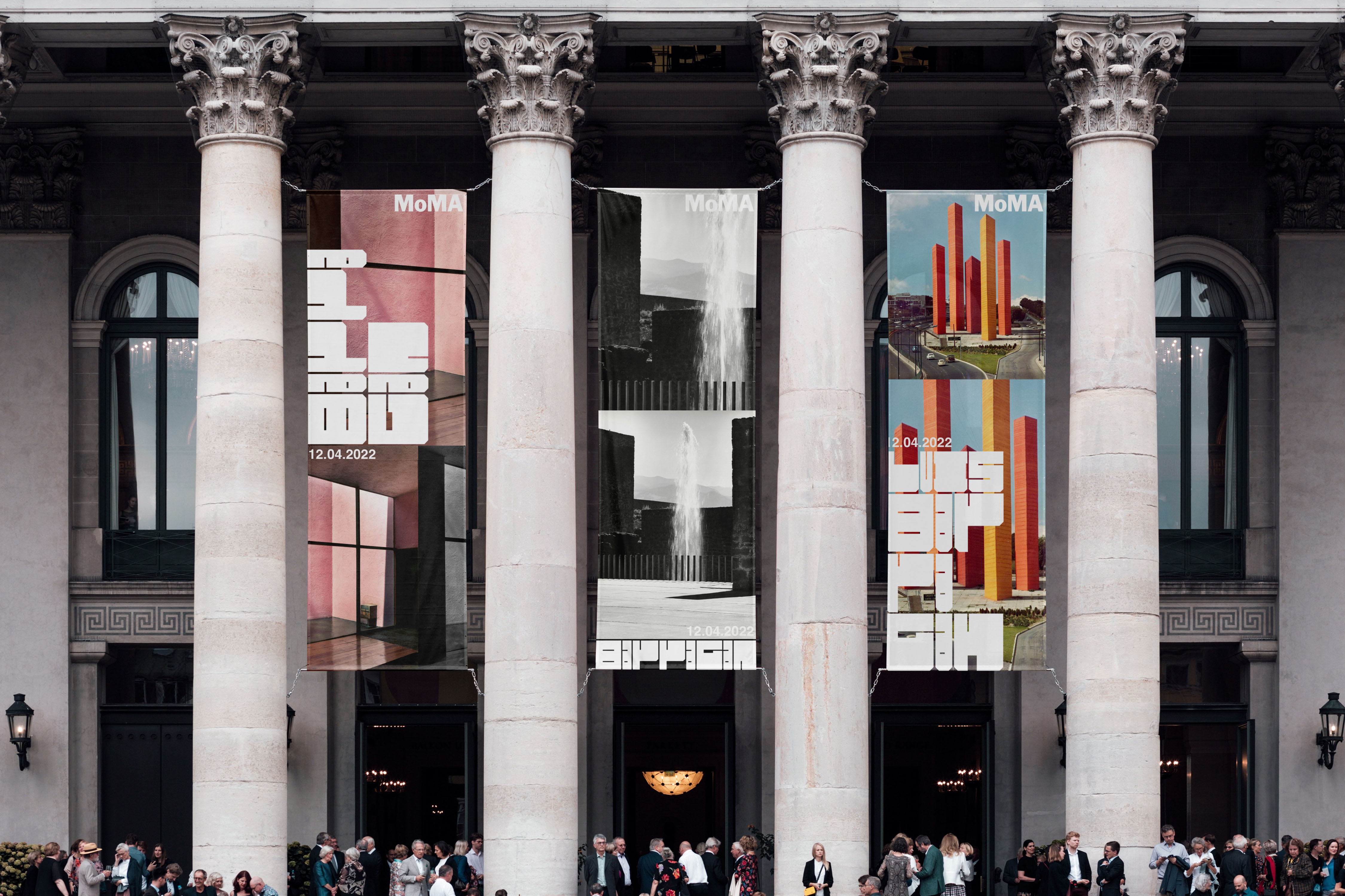
The whole branding is created by the custom typeface which reflects his trademark with blocky and colorful structures to visually personify his works. The diagonal part of the type and image were inspired by his architectures. While creating the layout of the image, it was systemized with black and color variations to create interesting balance.
The whole branding is created by the custom typeface which reflects his trademark with blocky and colorful structures to visually personify his works. The diagonal part of the type and image were inspired by his architectures. While creating the layout of the image, it was systemized with black and color variations to create interesting balance.